Intertwined
Sprite Future Improvement
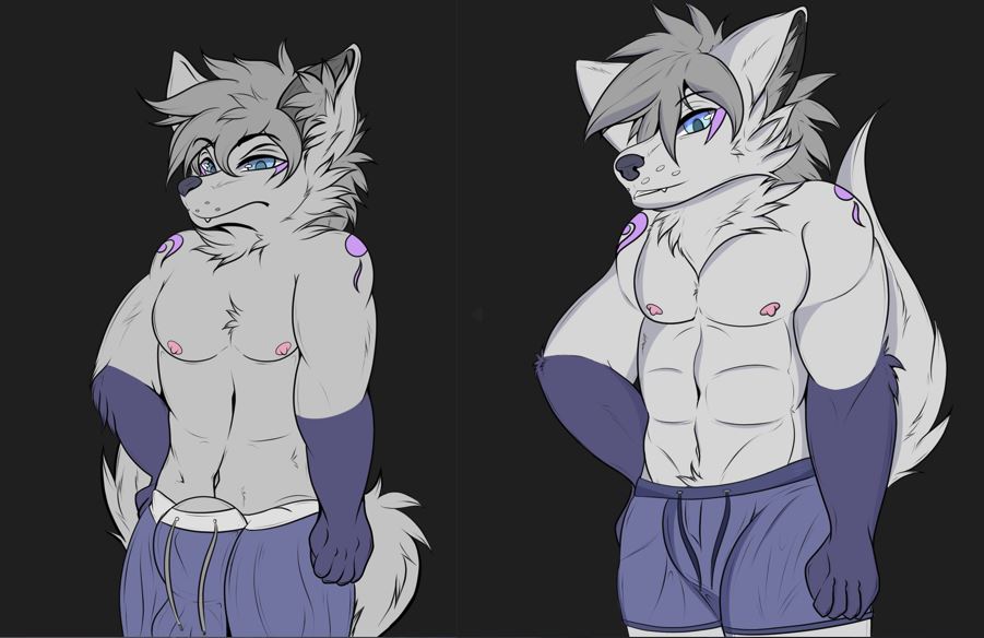
Hey all. This small comparison is a quick thing I drew up as I want to continue pushing Intertwined in a direction that really helps to drive home what the game is supposed to be about and my skills as an artist continue to improve so naturally, I want to also improve on the sprites when I can. These potential changes will not go live until I complete all the potential updates I have in mind to further polish the game.
Note: The story will not be affected by any changes. The only potential story changes will be adding in more world-building as that was a large request amongst players.
Place your comments or concerns below at the potential sprite adjustments!
Comments
Log in with itch.io to leave a comment.
I like the body profile of the sprite on the right (more balanced and less hyper), though the head design for the sprite on the left is cuter. Also always good to get new content for him; astronomically high cuteness levels.
From an overall standpoint, I like the one on the right mainly because the hips do not seem overly large relative to the upper body and shoulder width.
As for the private bits, it is up to personal preference of the user whether they like hyper bits or not.I personally like having fewer hyper elements.
Yeah the body went through the biggest change it seems. My art style is slowing improving hence why I want to adjust the sprites every little bit when things get a bit different. I personally do like the larger look of the private bits but it distracts from the story so had to adjust a bit for the normal sprites. The naked sprites will be more revealing obviously but yeah hehe got to have a good balance!
On another note, I guess theyre gunna wear compression underwears now =w= XP hehe
Kinda. I did make a slight adjustment to that as someone else pointed it out. I'm trying to get a balance between pretty large and not being comically so.
I prefer seeing both eyes, but this is minor. Adding more definition to the abs and pecs is nice, but it doesn't yet quite pop still, it looks quite flat, you may need to examine/consult some guides or others on it, as the torso itself seems stiff as well. If you notice the first sprite has slight curves to it, which help show its angled direction (the way the character is facing). As far as the goods are concerned, I do not mind them being apparent, just covered, as public social norms would dictate, but of course modest proportions. Perhaps a balance could be made if you made the bulge from the first one slightly smaller/more concealed? Because in the second one, suddenly there is no trace of having a pair at all.
Only real concern/must I see is the torso area.
I still have some work to do as an artist on torsos so maybe in this update but down the line I intend to continue working and eventually get better looking sprites as the game continues on. I did hide the bulge in the dressed sprites because of the serious nature of the game outside of the nsfw stuff. He is still packing, but I did not want to make that the main focus while dealing with the actual story.
Logical!
I did a small edit and showed it on the discord if you wanted to see. I expanded the bulge slightly.
Melmond still gunna be blushing staring at ye anyway
Yep. This will definitely happen!
The sprite improvemnt is great you still get the same vibe from it as you would from the old one
Awesome. Thats the vibe I am going for!
the new form looks slick 🤩 tho i will admit the big bulges always made me giggle 😆 (i liked them)
I do know a lot of people liked the bigger sheathes. Maybe as an easter egg or an unlockable I will put them somewhere but for the main sprites I wanted a slick look.
Hi, Yukine!
IMHO new (right) sprite looks better. That early type round huge sheath looks odd for me.
My art style was geared towards hyper-looking stuff hence why it bled into this. Been trying to fix that over the course of the game lol.